ParkDirect
Parking made with you in mind
Rethinking the Parking Search
Overview
ParkDirect is a conceptual parking mobile experience designed to make finding the right parking spot easier and less overwhelming. Instead of making drivers sort through endless options, ParkDirect considers what matters most to them like price, distance, and convenience.
Finding parking is a decision, not just a search
Drivers often need to balance price, distance, availability, and convenience across multiple options. ParkDirect was designed to simplify that decision by helping drivers quickly identify the option that best fits their needs.
Understanding the parking problem
Literature Review
To begin, we reviewed research on urban and smart parking to understand common challenges drivers face. Across the literature, a consistent goal emerged: making parking more efficient, accessible, and user-centered. This helped us identify opportunities to improve how drivers discover, compare, and choose parking.
Competitive Analysis
We analyzed existing parking apps and services to understand what they do well, where they fall short, and where ParkDirect could create a better experience for drivers.
Spot Hero
Booking marketplace
Yelp
Crowd-sourced reviews
ParkMobile
Pay-for-parking app
Key Takeaways
- Parking prices, fees, and availability aren't always clear or predictable
- Existing parking apps can make finding and comparing options unnecessarily difficult
- Users often lack complete information about parking locations and spaces
- Competitors tend to solve individual parts of parking rather than the entire decision-making process
What drivers told us
Five interviews with drivers who regularly navigate paid parking in Atlanta
Sandy
Turner
Luka
Riley
Shaun
What we heard
-
1
Real time availability is missing
GPS apps show garages but not open spots. Drivers want to know if a lot is full before driving to it.
“If there's only one spot left, I wouldn't bother heading there since it might be taken before I get there”
-
2
Distance is negotiable, price isn't
Most want a 2-5 minute walk, but a good price justifies going further. The tradeoff runs both ways.
“For a good enough price, I can always justify the walk”
-
3
Prices feel unpredictable
Surge pricing and event day rates catch drivers off guard.
“The surface lot did surge pricing on weekends, $20/hr”
-
4
Too many apps, too much friction
Drivers resent downloading a separate app per garage.
“There are so many apps to download because they all use different ones. It is annoying.”
-
5
Safety shapes garage choice
Lighting, cameras, and gated entry make a garage feel worth the extra cross over street parking.
“They are typically safer, well lit, and have cameras”
Affinity Mapping
After conducting interviews, we used affinity mapping to organize participant responses and identify recurring behaviors, pain points, and needs.
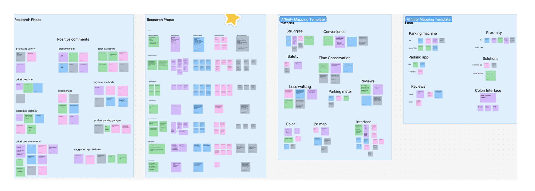
We grouped similar observations to uncover key themes around parking availability, price, distance, existing tools, and efficiency. These themes helped us translate individual interview responses into broader user needs and informed the direction of the project.
Observations
We found that drivers struggle with limited parking availability, high costs, and inefficient ways to find parking. They want to quickly compare options based on price, distance, and availability, while existing tools often lack the real-time information needed to make confident parking decisions.
Persona
Based on our research findings, we developed a persona representing the needs, behaviors, and frustrations of our target parking user.

Name: Jordyn Mitchell
Occupation: Real estate agent
Location: Atlanta, GA
Statement: I need to find affordable, available parking quickly without wasting time searching.
About:
Jordyn is a busy real estate agent who frequently drives around the city for work and client meetings. She values convenience and affordability. She wants to find reliable parking without wasting time searching.
Painpoints:
- Finding parking can take too much time
- Parking prices can be pricey and sporadic
- Existing apps don't show real time availability
Goals:
- Find available parking quickly
- Compare prices and distances easily
- Avoid wasting time searching for a spot
Defining the user flow
To translate our research findings into the product experience, we mapped out the primary path a driver would take to find and select parking.
-
1
Enter destination
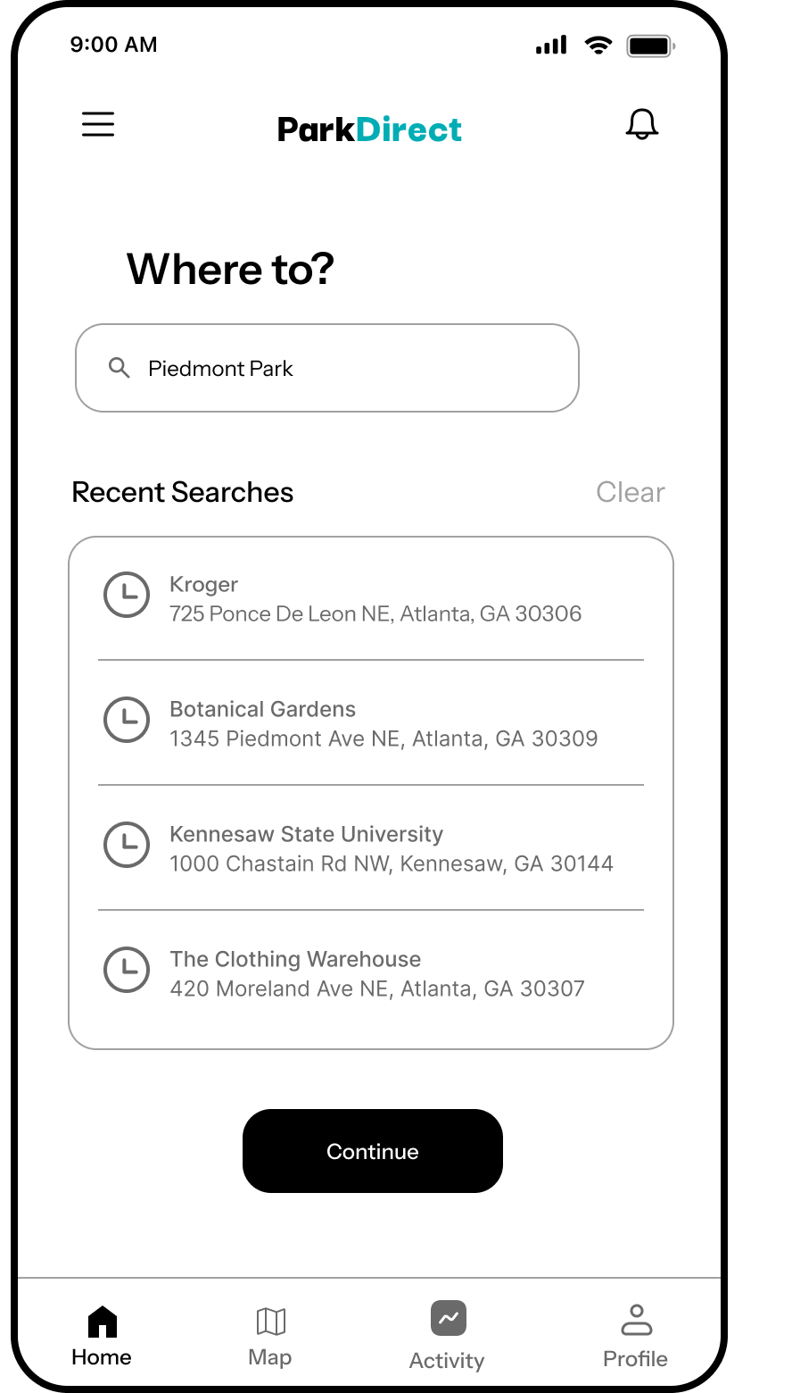
Driver types or selects where they're headed
-
2
Enter time and date
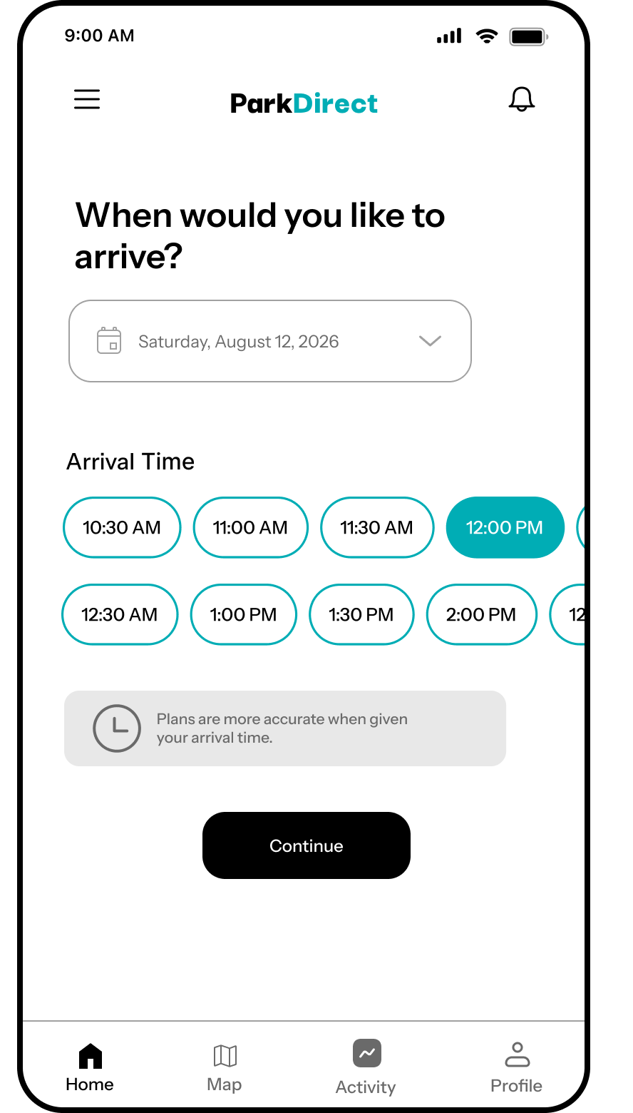
User will select their preferred time and date details to create a reservation
-
3
Compare different features
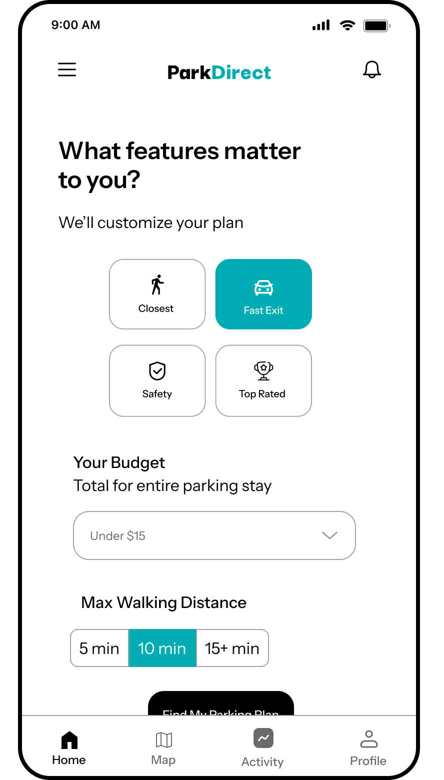
Driver weighs options against key deciding factors such as price, distance, and availability
-
4
Review recommended option
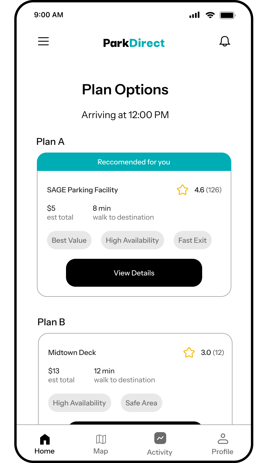
Driver reviews the top recommended spot based on their priorities
-
5
Select a parking location
Confirm hours, pricing, entry info before heading over
-
6
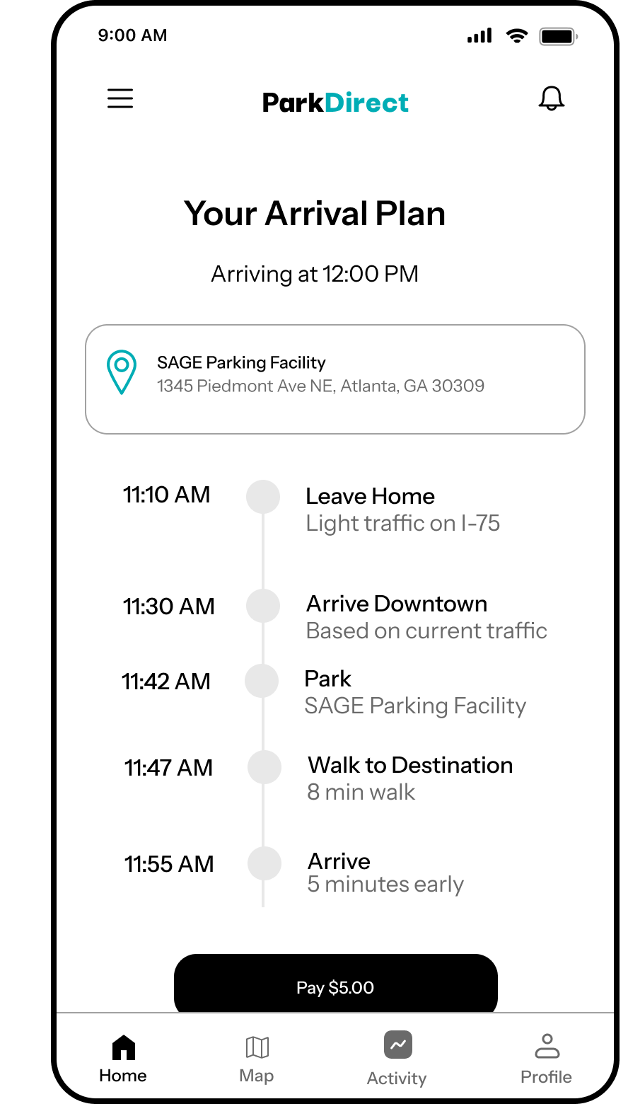
Get arrival plans
App routes the driver to the chosen location
Designing the framework
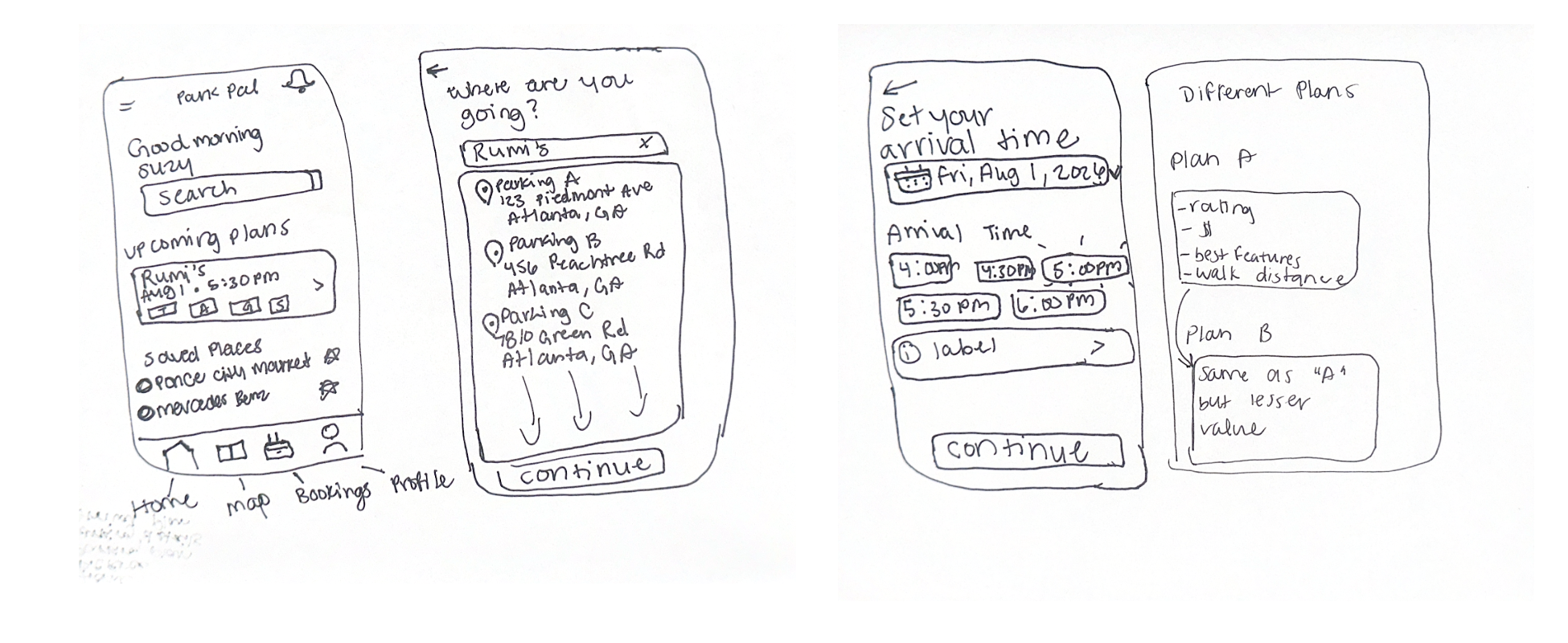
I created low-fidelity wireframes to explore the structure and functionality of ParkDirect before moving into visual design. I focused on creating a simple and intuitive experience while addressing the pain points identified during research. The wireframes also gave me an opportunity to test different layouts and interactions early in the process, allowing me to make structural changes before investing time in the final visual design.
Next I created a style guide that I thought would reflect the vision of ParkDirect. A lot of users communicated that they would expect the app to be blue, a color known for its calmness, trust, and clarity so I wanted to incorporate that, in addition to neutral light/dark greys throughout the interface. As for the font, I chose Instrument Sans for its clean, modern appearance and strong readability, supporting ParkDirect's simple and efficient user experience.
Instrument Sans
ABCDEFGHIJKLMNOPQRSTUVWXYZ
abcdefghijklmnopqrstuvwxyz
0123456789
The final experience
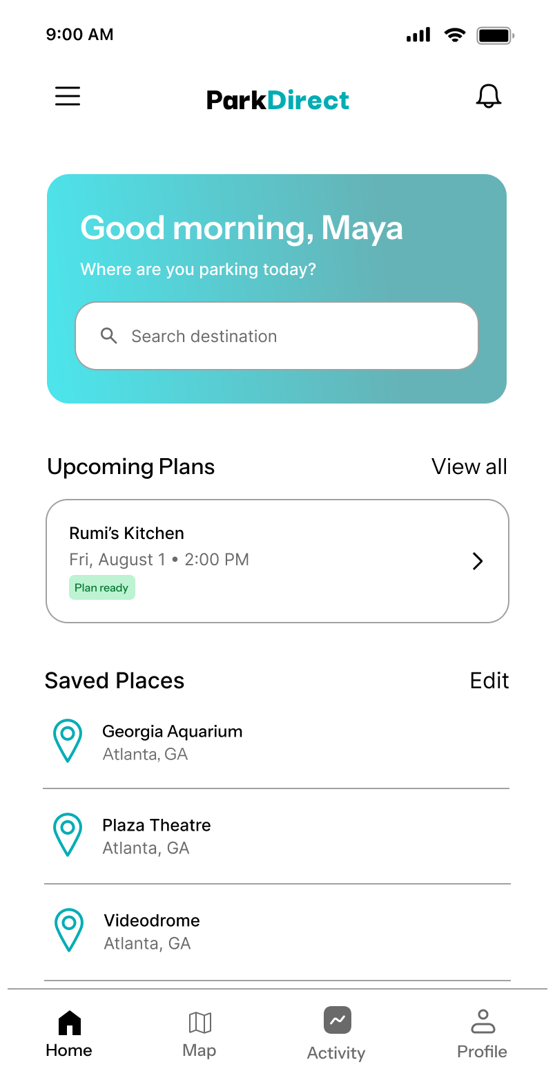
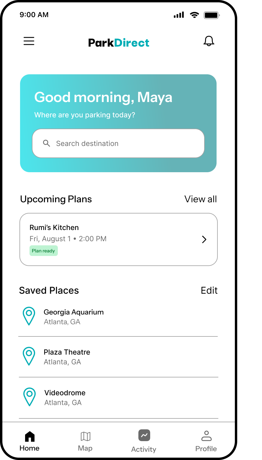
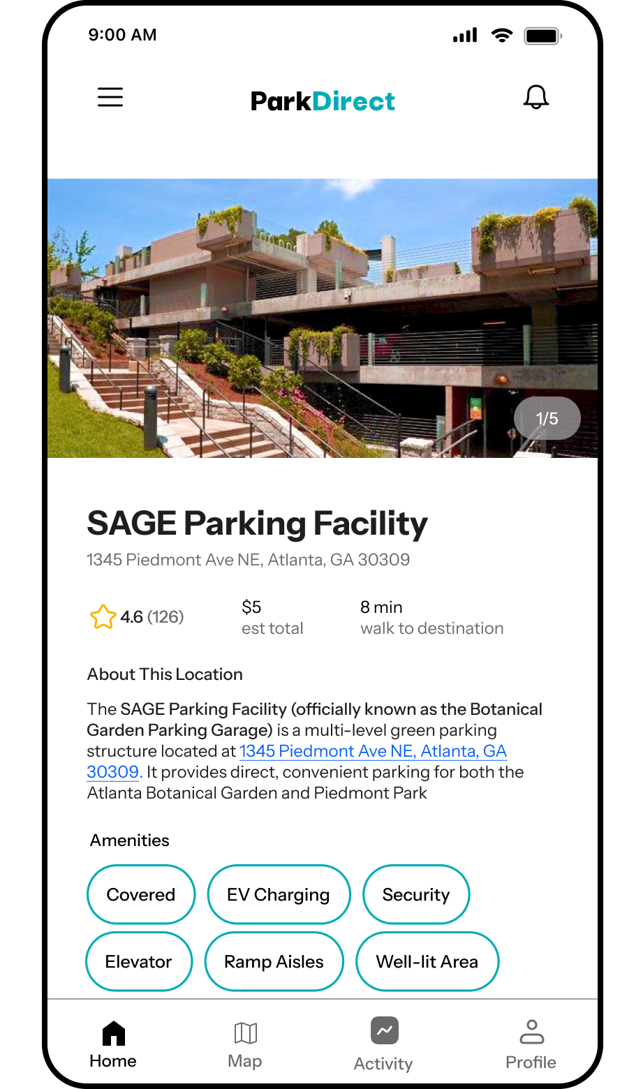
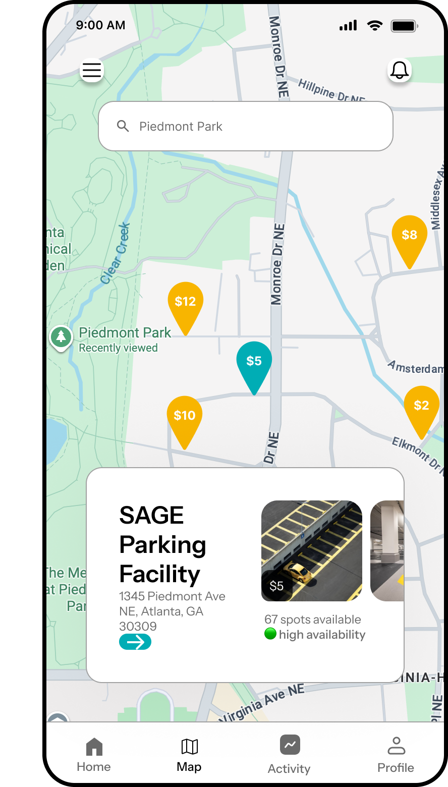
The final design brings together our research findings into a streamlined parking experience. ParkDirect helps drivers quickly find, compare, and select parking based on key factors like availability, price, distance, and time.
Reflections
- I learned to treat information hierarchy as a design tool, making high priority details like availability, price, and distance immediately visible so users could make decisions faster.
- Research showed me what was frustrating users, but the real challenge was translating those findings into the interface. This pushed me to carry research insights through every design decision rather than letting them stop at the research phase.
- If I were to continue the project, I would validate the final design with more users to better understand how well it supports real world parking decisions.