Testing Microsoft Outlook's Everyday Workflows
Overview
I conducted a usability study of Microsoft Outlook as part of a small research team. Together, we planned and moderated task-based sessions with six participants to evaluate how well Outlook supports everyday scheduling and email workflows. Through observing participants complete common tasks, we identified patterns in their behavior and uncovered areas where the experience could be clearer, more intuitive, and easier to navigate.
Goals
- Discover pain points within Outlook's interface
- Explore ways to increase user satisfaction from users' perspectives
Why test Outlook?
Microsoft Outlook is one of the most widely used personal information managers in the world, spanning college campuses, corporate networks, and enterprise teams. It's used daily for email, calendaring, contacts, and task management, and integrates tightly with the rest of Microsoft 365. But a massive install base doesn't mean a frictionless experience, and we wanted to find out where everyday users were actually struggling.
Evaluation Questions
- How easily can users schedule or otherwise plan sending specific emails?
- What issues prevent users from finding their important emails in Outlook?
- How effective are the schedule management tools in Outlook?
Putting Outlook to the test
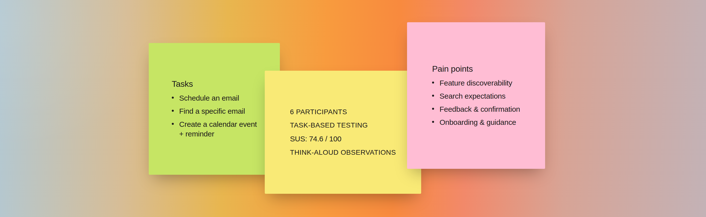
We recruited 6 participants from our own social circles, with mixed familiarity with Outlook, from daily users to near first-timers. Sessions were held individually over Zoom, screen-recorded for review, and moderated using a think-aloud protocol.
The tasks
Each participant completed three scenario-based tasks in the same order, using a shared dummy Outlook account.
Schedule an email
Compose a provided email and use Schedule Send to send it at a specific future date and time
Find a specific email
Locate a previously flagged email using search or the filtering system
Create a calendar event with a reminder
Add a new calendar event with a title, time, and location, then set a reminder for one day before
Insights from participants
Outlook didn't confirm that a scheduled send had been set, leaving the participant unsure if they were finished.
Schedule Send is tucked behind a small dropdown arrow next to the Send button, and the reminder button in event creation was often missed at first.
With no onboarding or contextual hints, participants often had to guess their next step, even ones who used Outlook regularly.
One participant's multi-criteria search returned an error, another entered criteria incorrectly, and a third skipped search entirely and scrolled the inbox instead.
Task-level results
n = 6
| Task | Avg. Time* | Success Rate | Error-Free Success | Avg. Errors | Avg. SEQ |
|---|---|---|---|---|---|
| 1 · Schedule an email | 3.33 min | 83% | 50% | 1 | 5.33 |
| 2 · Find a specific email | 1.33 min | 83% | 50% | 0.5 | 6.67 |
| 3 · Calendar event + reminder | 2.17 min | 83% | 17% | 1.33 | 6.00 |
*Times were recorded to the nearest minute; the two-decimal averages come from averaging six whole-minute values, not added precision in measurement.
Task 1 took the longest and saw the most hesitation. Low visibility of the Schedule Send option led participants to guess at their next step. Task 2 was the fastest, had the fewest errors, and scored highest on SEQ, though only one of six participants used the filtering system rather than the search bar. Task 3 had the lowest error-free success rate, just 17%, the strongest signal that the reminder step needs better visibility.
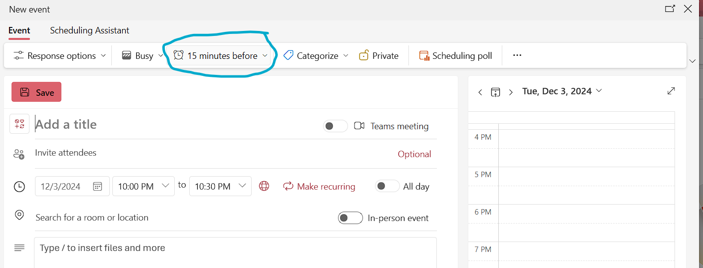
The reminder control (circled above) was fully visible in the event creation screen. Still, several participants wondered aloud where to set a reminder before noticing it, a classic recognition-over-recall failure, and the main driver of Task 3's low error-free success rate.
Overall usability score
After finishing all three tasks, each participant completed the System Usability Scale (SUS), a standard 10-question survey that converts to a single 0–100 score, letting us compare Outlook's usability against an established benchmark rather than just our own impressions.
System Usability Scale Score
A score in this range means the core experience works and feels familiar, but still has clear, fixable friction, consistent with what we heard directly from participants above.
Key findings
- The system did not notify users when errors occurred
- The system did not always confirm a successfully completed task
- Features had low visibility and were easily overlooked
- Features were not optimized to match user expectations
Turning findings into recommendations
The goal of the study was to identify and prioritize opportunities to improve the Outlook experience. Our final deliverable was a set of actionable recommendations, each grounded in a specific moment of friction observed during testing. This helped connect our findings to practical opportunities for improving usability and clarity.
01
Support multi-criteria search
Let users search by sender and subject simultaneously instead of throwing an error
02
Notify users when errors occur
Surface a clear message whenever an action fails, instead of failing silently
03
Confirm successful task completion
Show explicit confirmation after actions like scheduling a send or saving an event
04
Increase visibility of key features
Bring high-value functions like Schedule Send out from behind secondary menus
05
Provide onboarding for new users
Offer an optional guided walkthrough for first-time or infrequent users
Reflections
- This was my first usability test conducted at this scale, and it reshaped how I think about research within the design process: not as a separate phase, but as the foundation the rest of the work stands on.
- Watching participants "get lucky" while guessing their way through tasks was a clear reminder that designers can't assume users will interact with a product the way it was intended.
- If I were to continue this project, I'd want to prototype fixes for the top recommendations and re-test with the same tasks to see how much the SUS score actually moves.