Better Choice
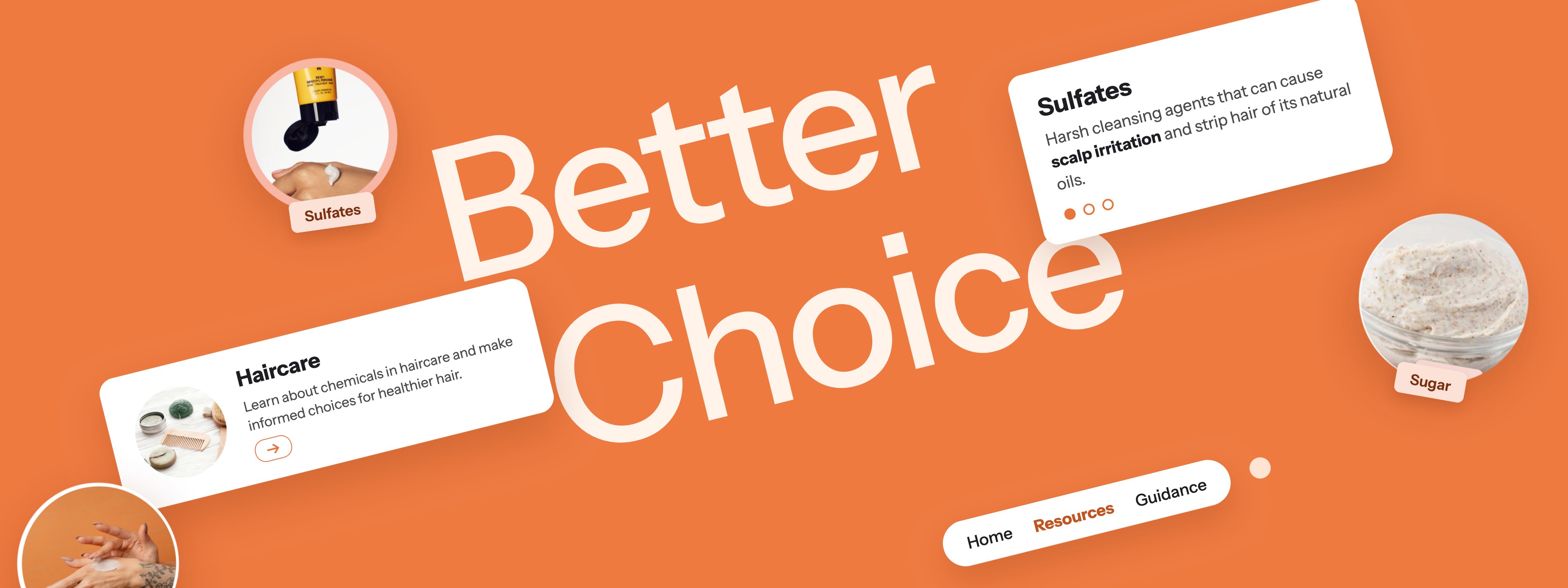
Making Informed Choices Easier
Overview
The brief was to design an informative website that teaches users something new. I created Better Choice, an educational platform that makes the harmful substances found in everyday products easy to understand, and pairs each one with healthier alternatives.
Objectives
A clear, intuitive interface
Clear navigation pathways and direct labeling guide users from one section to the next, keeping friction low and making the experience feel effortless.
Design grounded in the Laws of UX
I applied established psychological principles to design around real user behavior and expectations, so every interaction feels familiar and predictable.
Content structured through information architecture
Headings, subheadings, and visual aids such as infographics and diagrams break complex information into digestible pieces.
Process
I began with a three-page proposal that defined the site’s purpose and its role in educating people about the effects of common consumer products. It also set out how each Law of UX would shape the final design.
The full proposal covers my design process in detail.
Read the project proposalApplying the Laws of UX
Multimedia Principle
The Multimedia Principle holds that people learn better from words and pictures together than from words alone.
How I applied it: I added explanatory graphics to every resource page, giving users a clear visual explanation alongside the written content.
Fitts’s Law
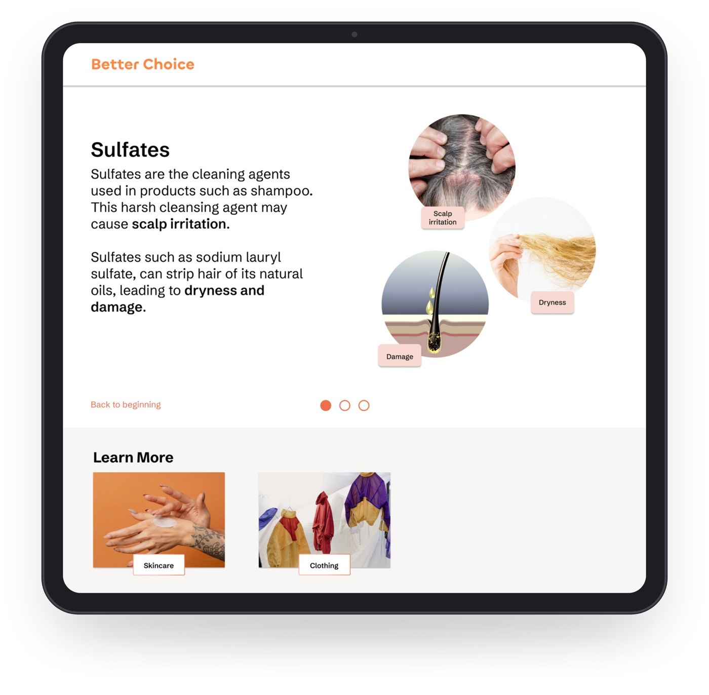
Fitts’s Law states that the time it takes to reach and interact with a target depends on the target’s size and distance.
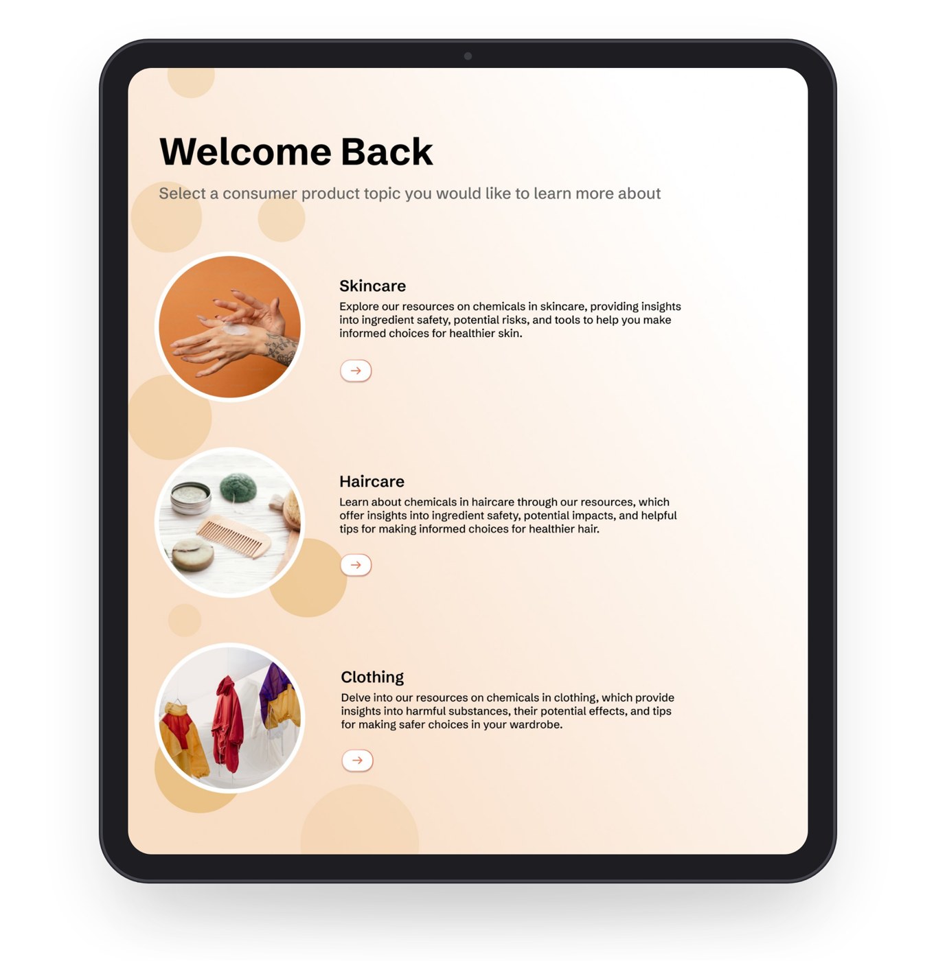
How I applied it: I designed large buttons throughout the site so users can reach a desired page quickly and with ease. Each page is also linked to its image and button, which enlarges the target and saves users from scrolling.
Zeigarnik Effect
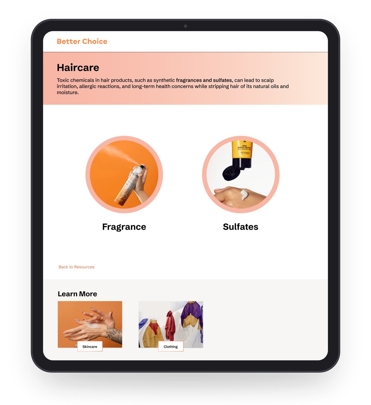
The Zeigarnik Effect states that people remember uncompleted tasks better than completed ones.
How I applied it: Each resource includes pagination showing how many pages a topic has and how many remain, which gives users a clear sense of progress and encourages them to finish.
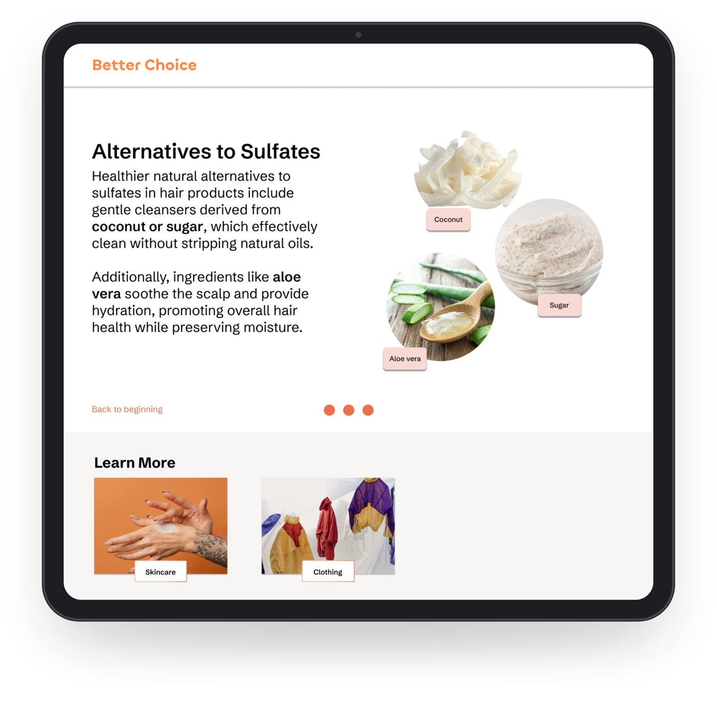
The final prototype
The finished experience presents healthier, eco-friendly alternatives to common substances in skincare, haircare, and clothing. Each topic works as a short lesson: how a substance affects consumers, and how its alternatives address the problem.
Reflection
Working on Better Choice reinforced how central user behavior is to web interface design. Many factors shape an experience, and it is the designer’s job to account for each of them in order to create an easy, stress-free experience for users.
Grounding decisions in the Laws of UX gave me a practical framework for that work. Pairing words with graphics, enlarging targets, and showing progress each solved a specific user need, and together they made a content-heavy topic feel approachable rather than overwhelming.
Designing the project solo also taught me to keep the information architecture and the interface working together. Clear structure and visual hierarchy made complex material easier to absorb, and I will carry that approach into future projects.